Member-only story
Ugly websites sell better.
Web design is getting out of hand again.

I’ve been in the web design business since 1998. It has gone through some phases, but the place its at right now feels the weirdest in a long time.
For years UX designers battled the “dribbblization” of the industry. What it means, is creating eye-candy projects and posing them as serious work.
Beautiful at first glance, but either impossible to code, or completely dysfunctional.
Form is taking over function. Again.
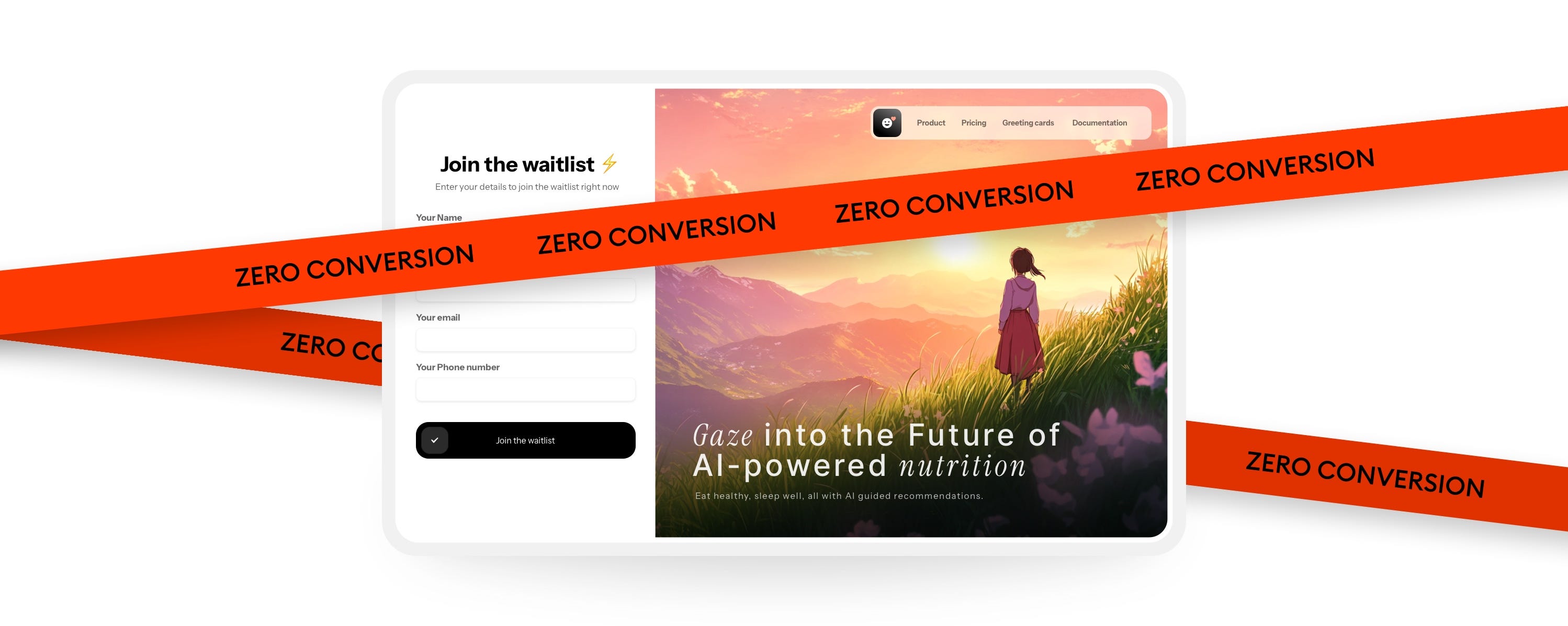
With animation tools and tutorials easily available, we get them animated too now. Here’s an example.

The problems with this design is high loading time (most people will click away), very vague and unconvincing copy and vertical animations that distract you from the main action.
It may look good, but it won’t work well. Or at all.
Understanding design
Let’s take a step back.
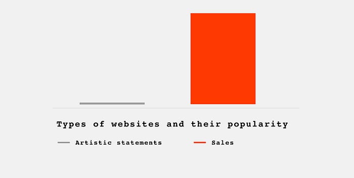
What is the role of a website? 99% of the time it’s to sell something. To get you to click a button.

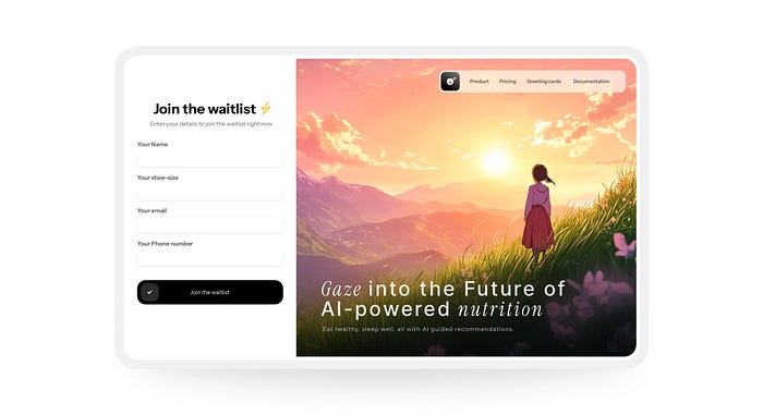
Beautiful background with mountains and a person gazing into the distance doesn’t sell. Sure, it tickles your sense of aesthetics. I’ll give you that.
But on its own that’s only a piece of artwork. Nothing more.

The newest design trend
Currently we see a trend of pretty images merged with mediocre UI exploding on social media.
Designs like this gets hundreds of reshares and millions of views.
