Member-only story
My secret to perfect Layout revealed
I made hundreds of website with this single blueprint!

Designing a great landing page or mobile app is a lot of work. There are no one-size fits all solutions, and using templates massively limits your potential to convert.
Each design needs to be tailor made to fit a specific products.
So is there anything they all have in common? Turns out there is!
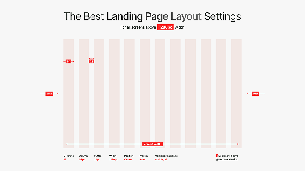
The Layout Settings
At Squareblack we’ve designed well over 200 landing pages since 2009. They ranged from campaign websites for kids tv shows, all the way to complex fintech products.
And everything in between.
The internet has change significantly since then and sometime around 2010 we realised that we are using the exact same approach to the basic layout structure of nearly EVERYTHING we do.

The main shift that happened is larger screens, higher pixel density and… the much lower attention spans of the users. Right now they’re at around 8 seconds — similar to that of a goldfish.
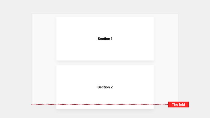
Back in the early 2000’s there was an obsession to keep as much content as possible above the fold. If you’re unfamiliar with the term, the fold is where the screen ends at the bottom of the browser.
What it means is how much of the website can you see.

In the example above including the client logos partially within the fold gives the user a cue that there’s more to see. So they scroll.
This technique is still valid, but it progressed from cramming as much content into each scrollable segment as possible, to just having enough so that people see that there’s more.

