Member-only story
Conversion rate optimization
Landing Page Blueprint Wires Destroy Conversions — Improve Yours Now!
Using them can cost you a lot of sales! But there is a way out!

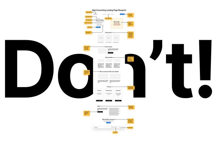
Don’t use landing page “conversion blueprints”. This is an expert deep dive into how those blueprints are made and why they’re bad for you.
Many social media posts share a high converting landing page blueprint. It’s usually long and complex and you think : “wow I need to follow that, sounds smart!”
Stop. Throw those away!

I’ll show you a two-step approach with which you’ll optimize your business yourself. Then I’ll tell you how to pick the right components for step 2 — the most important one.
And then you’ll be on your way getting more conversions.
Without all that pretend-complex BS people do to farm engagement.
But first let’s analyse a typical blueprint like that. Starting with the header.

Let’s start from the top. They always start with “defining” the basics like the logo (1), navigation (2) and header CTA button (3). The problem here is that not all landing pages need navigation.
Some shorter ones may not even have any sections besides the header and some social proof below. The CTA is always presented like this in the blueprints. A big, visible, colorful button. Usually the exact same color as the main CTA (7) and with the same copy.
This is bad. Two identical CTA’s compete for attention and the user may not click any of them. The better approach is to dim the top CTA until you scroll down the page and then make it more visible.
The kicker (4) is often called a “pre headline” which frankly I have no idea what that means. What I often found in those blueprints is that it’s used to define the user group. Why? What for? Why…
